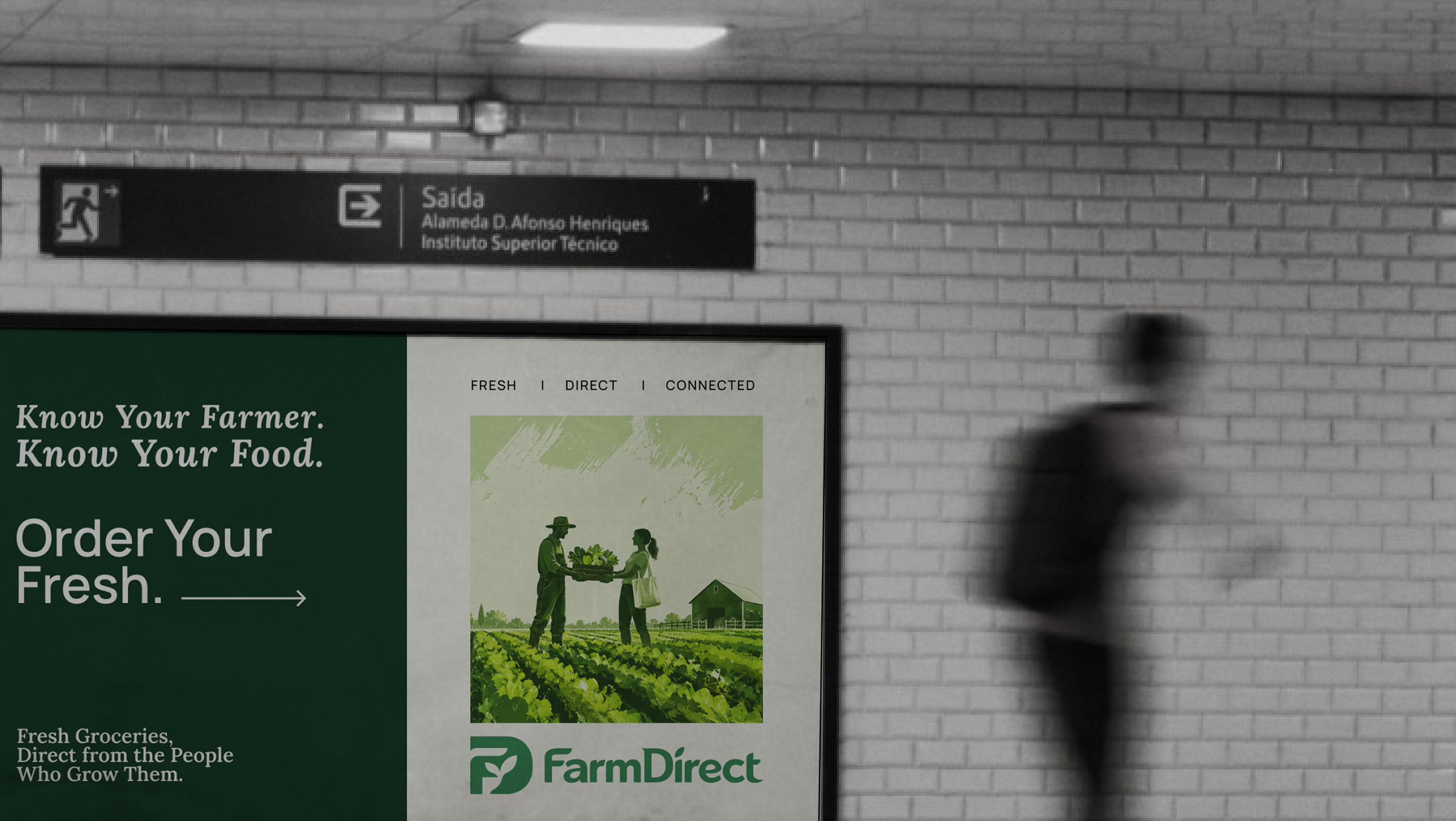
We developed the brand identity for FarmDirect, an agritech brand built around a simple idea: creating a more direct connection between farms, fresh produce, and the people who buy it.
Client
FarmDirect
Work
Brand Strategy &
Visual Identity Design
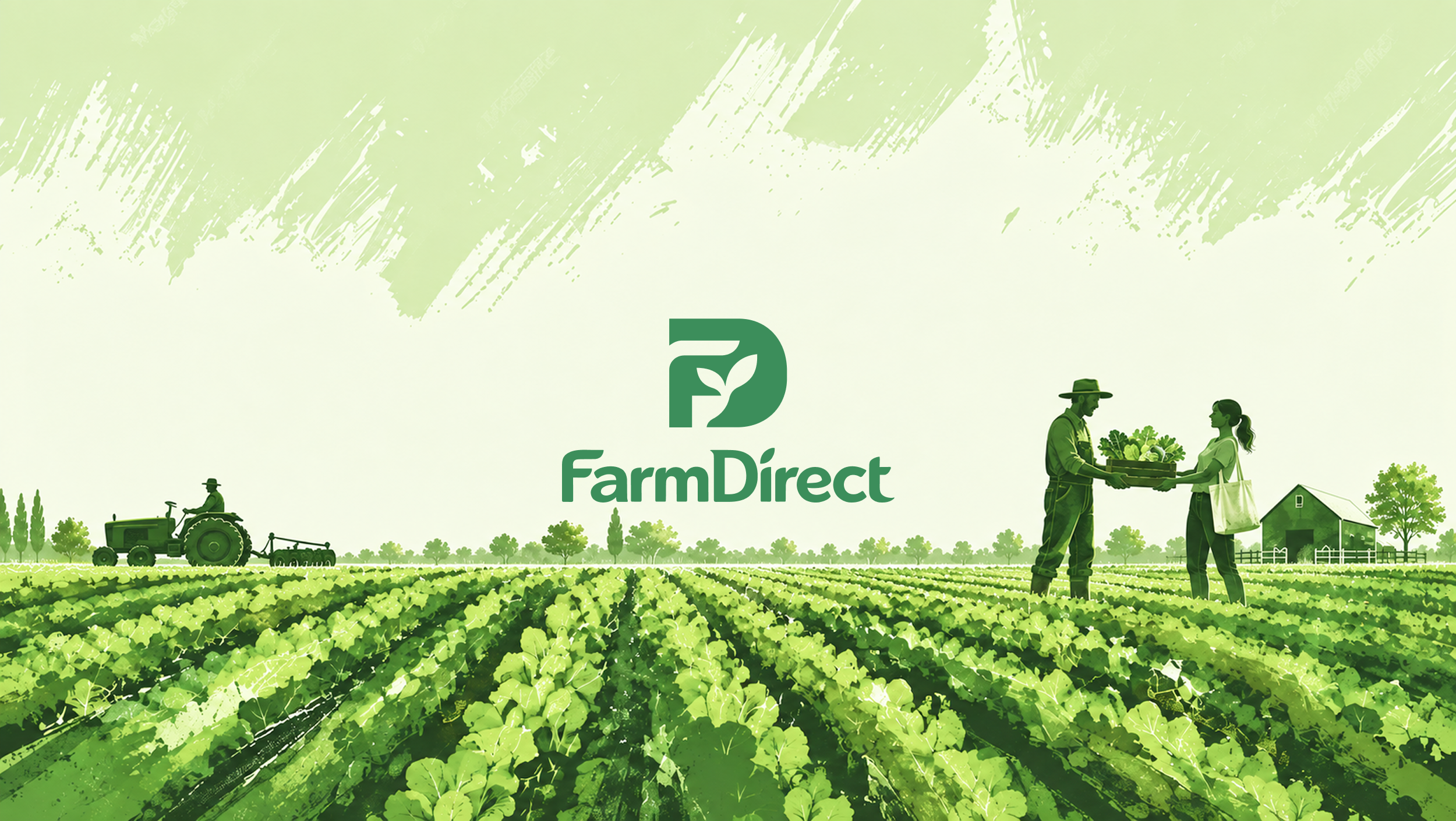
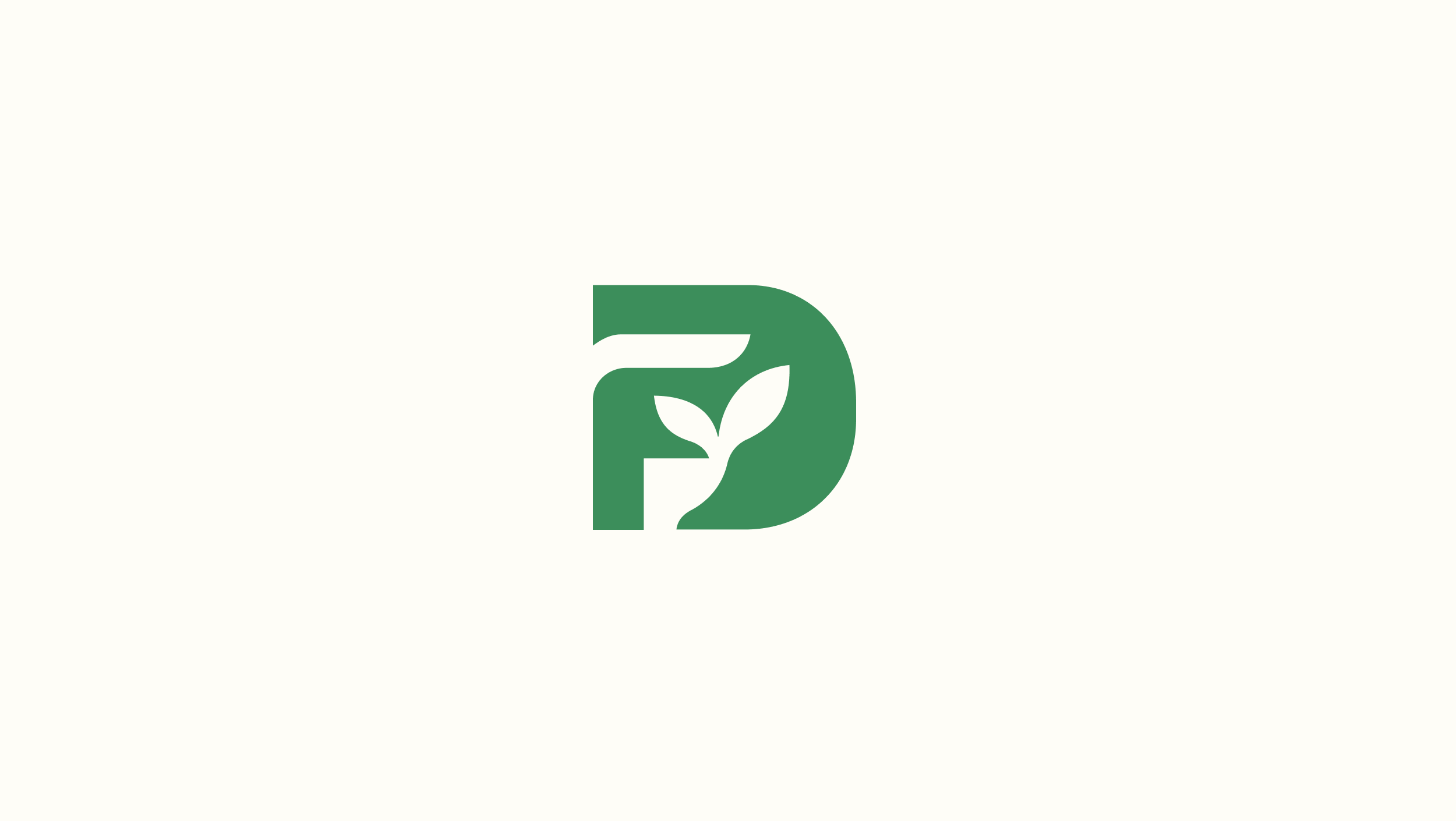
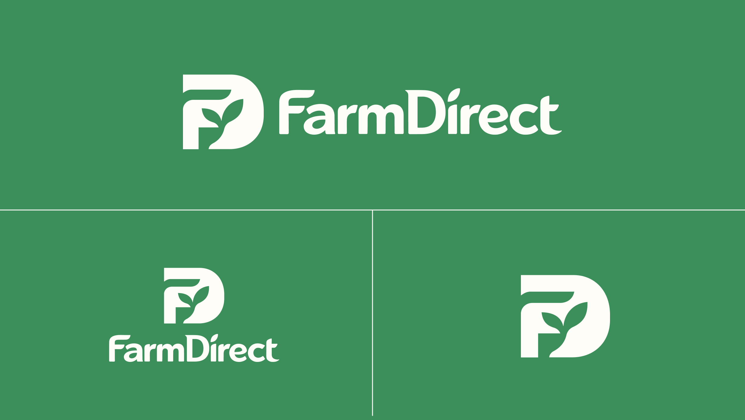
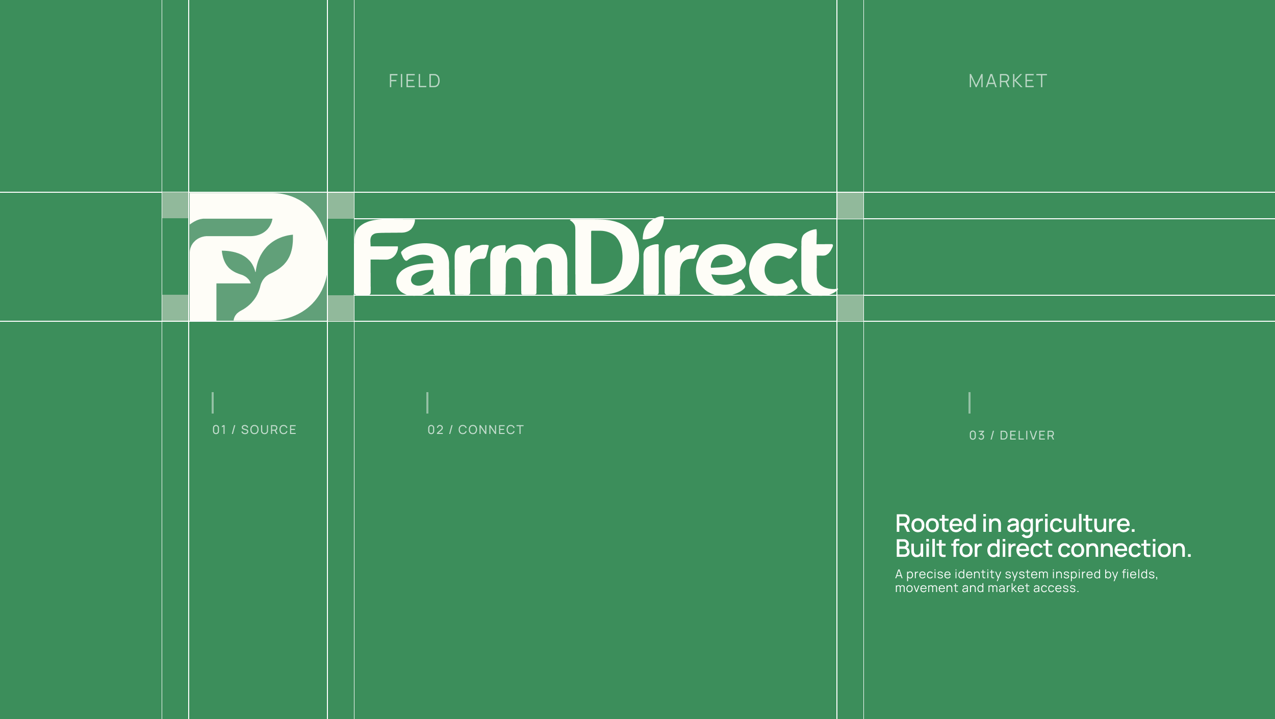
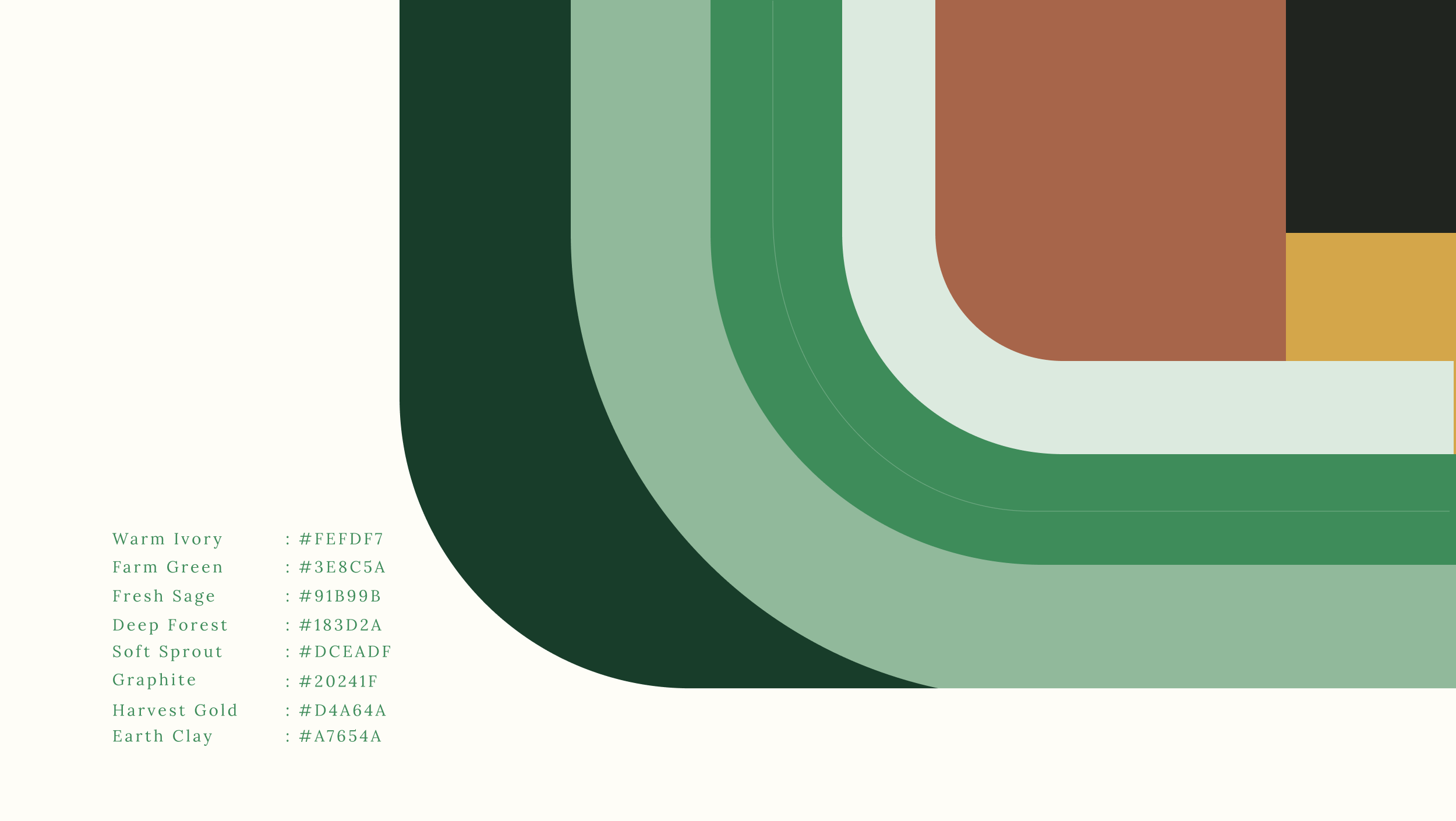
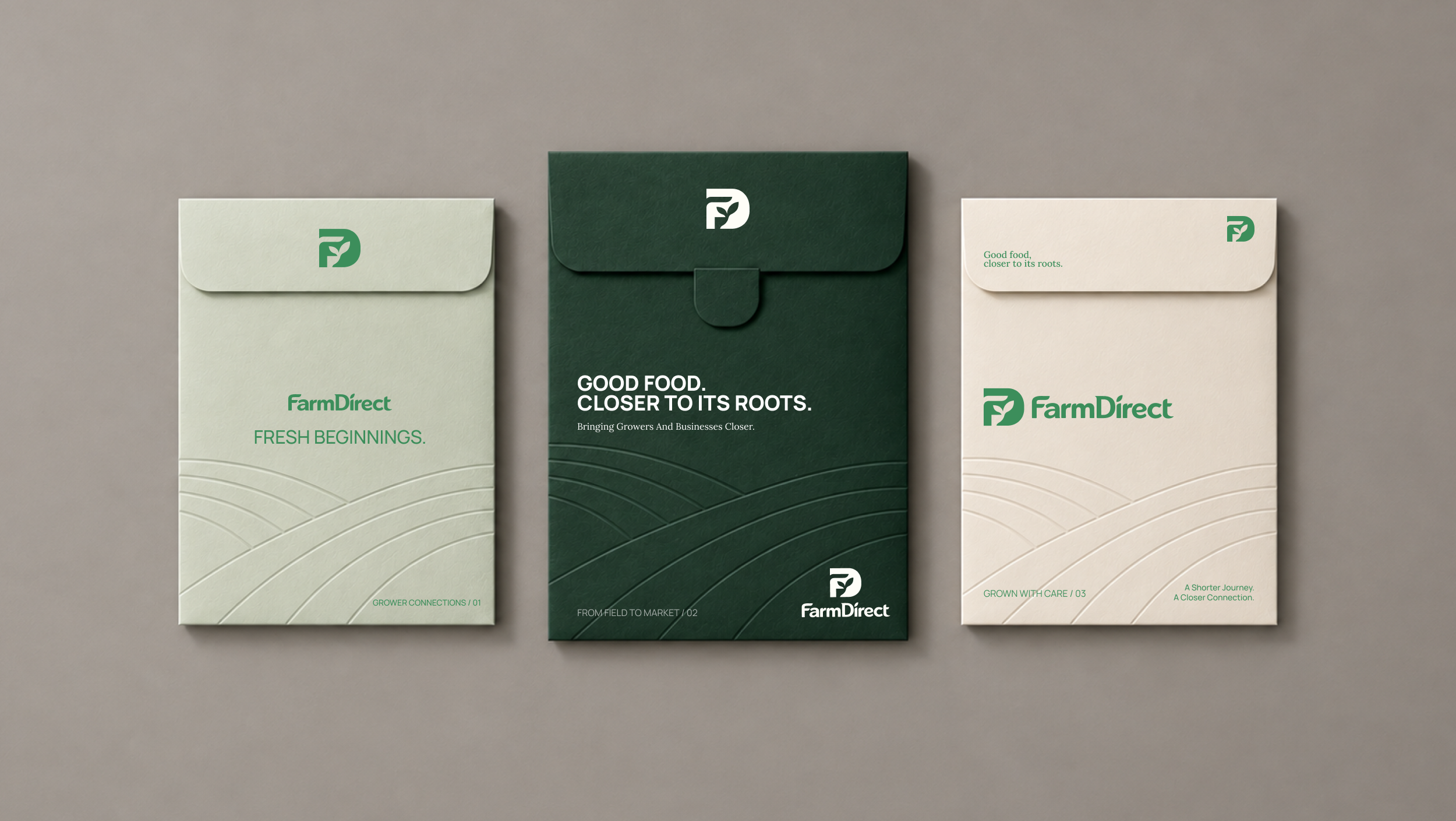
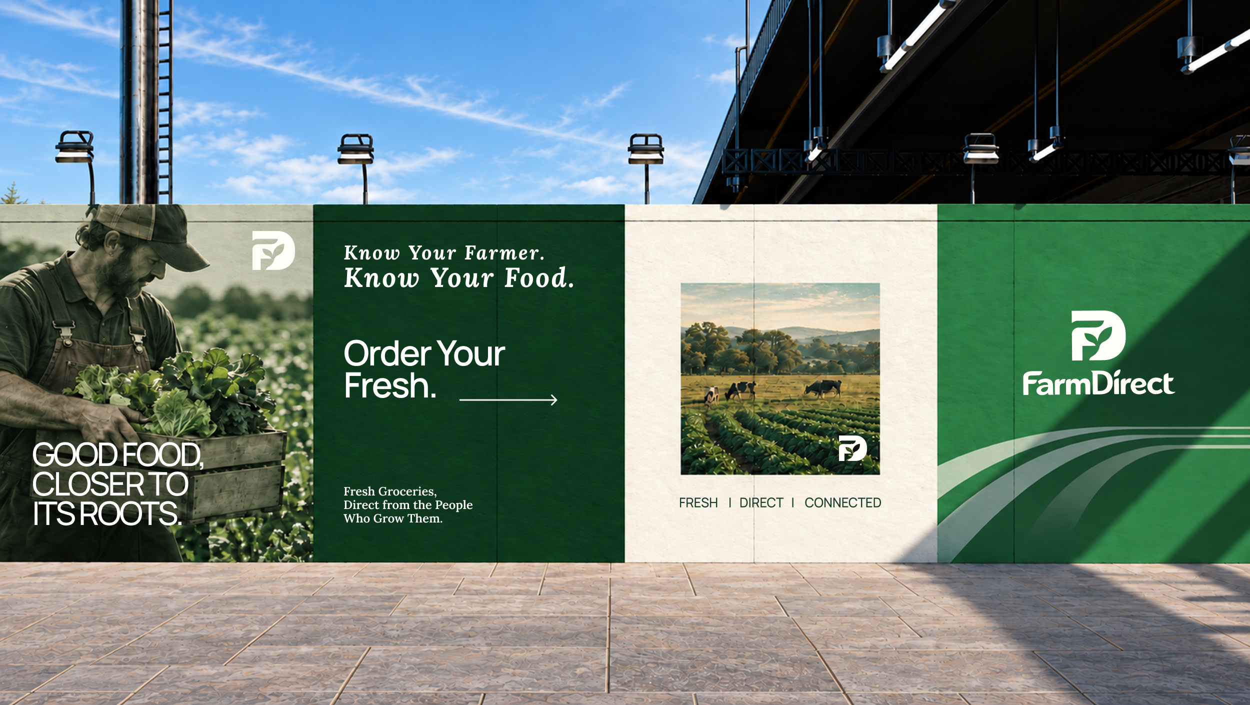
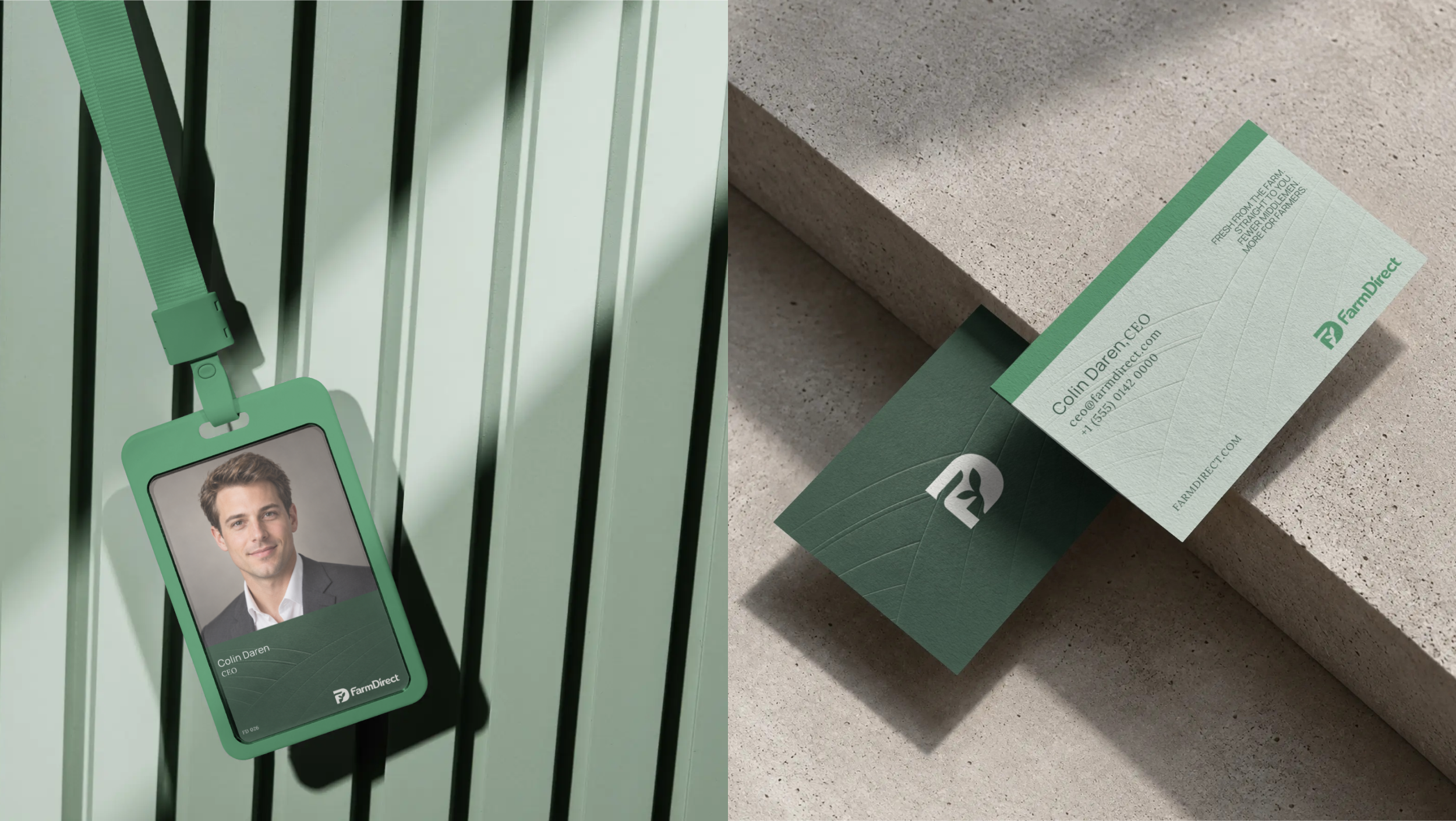
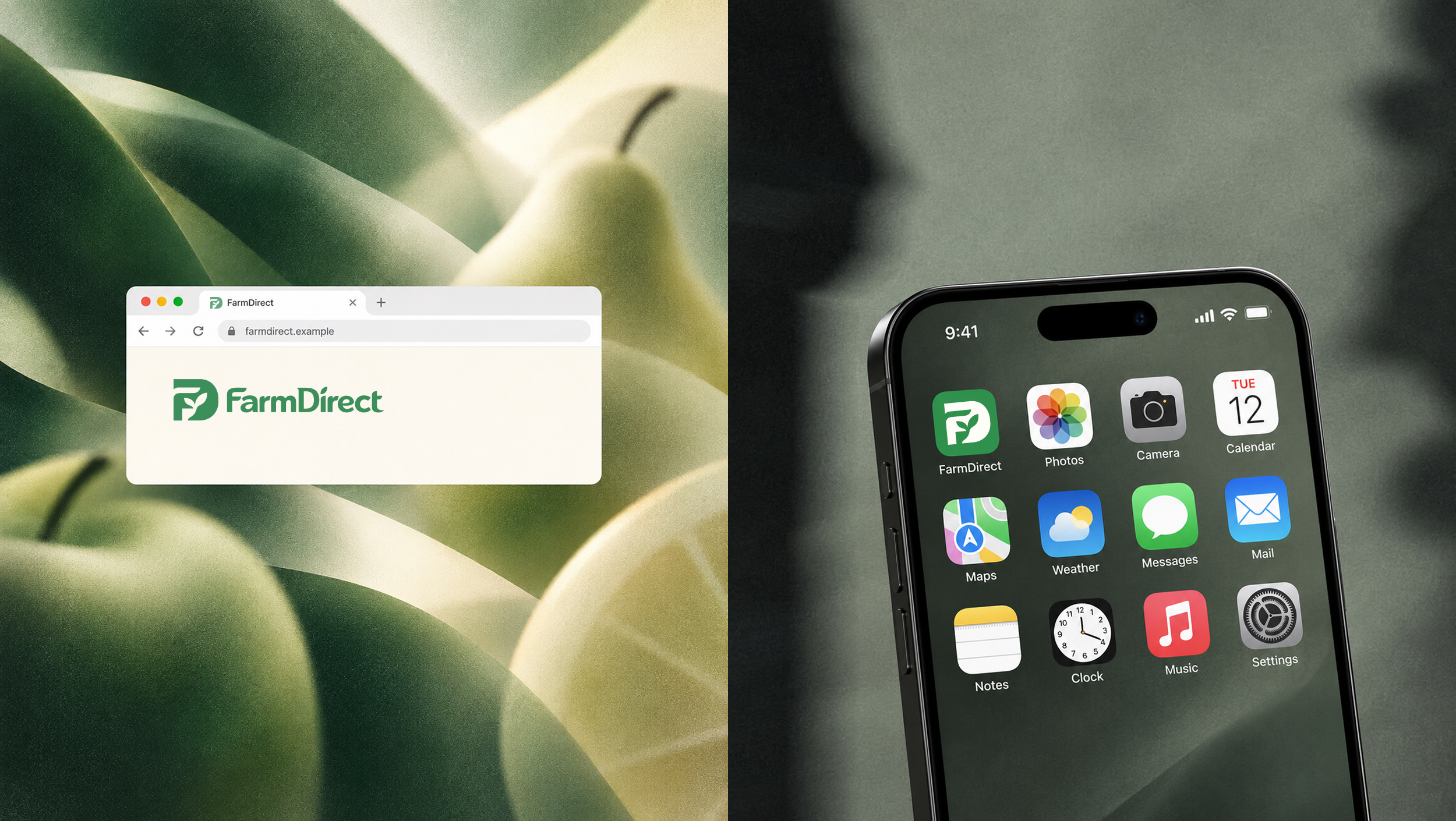
FarmDirect is an agritech brand designed to shorten the distance between farmers and customers. The identity brings together a distinctive FD monogram, a subtle plant-bud detail, natural green tones, and a modern visual system inspired by fields, movement, and direct connection. The result is a brand that feels fresh and agricultural without relying on traditional farming clichés—giving FarmDirect a more contemporary, credible, and scalable presence.
What We Did
→ A Brand That Connects Field to Customer
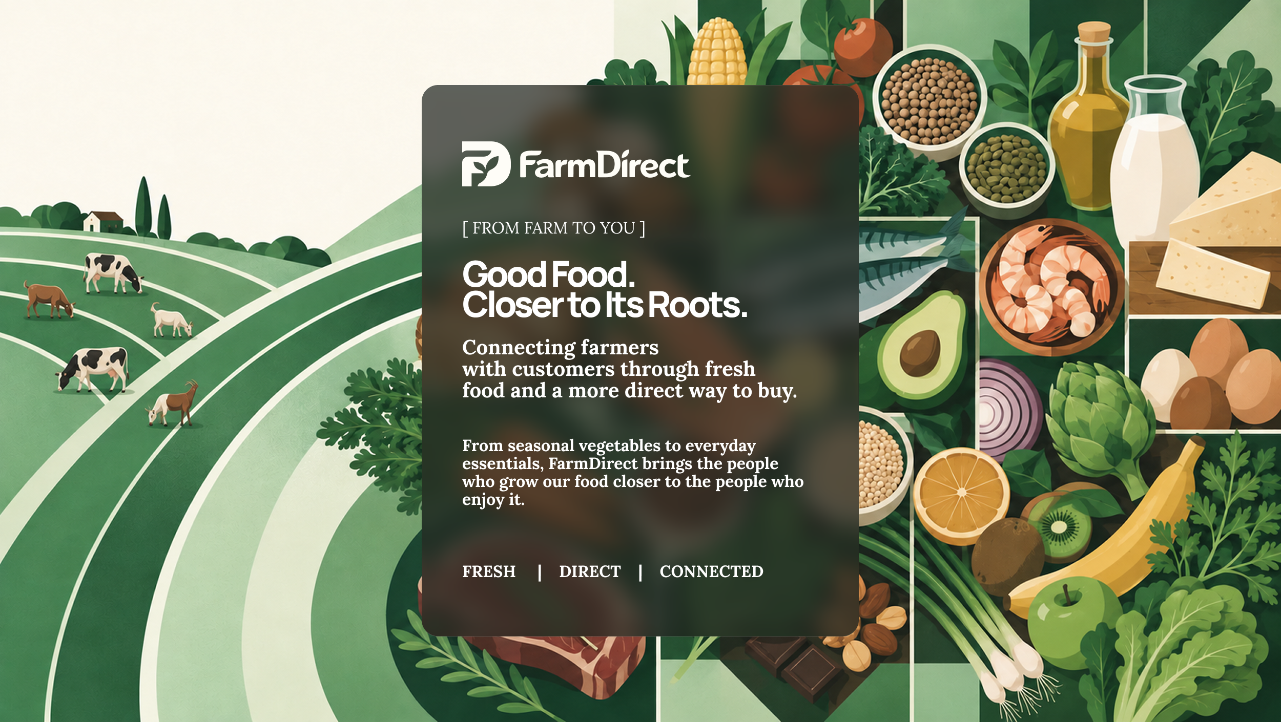
We shaped FarmDirect around one clear idea: making fresh food feel closer to where it comes from. The strategy focused on direct connection, trust, freshness, and a modern agritech experience built for both farmers and customers.
→ An Identity Rooted in Meaning
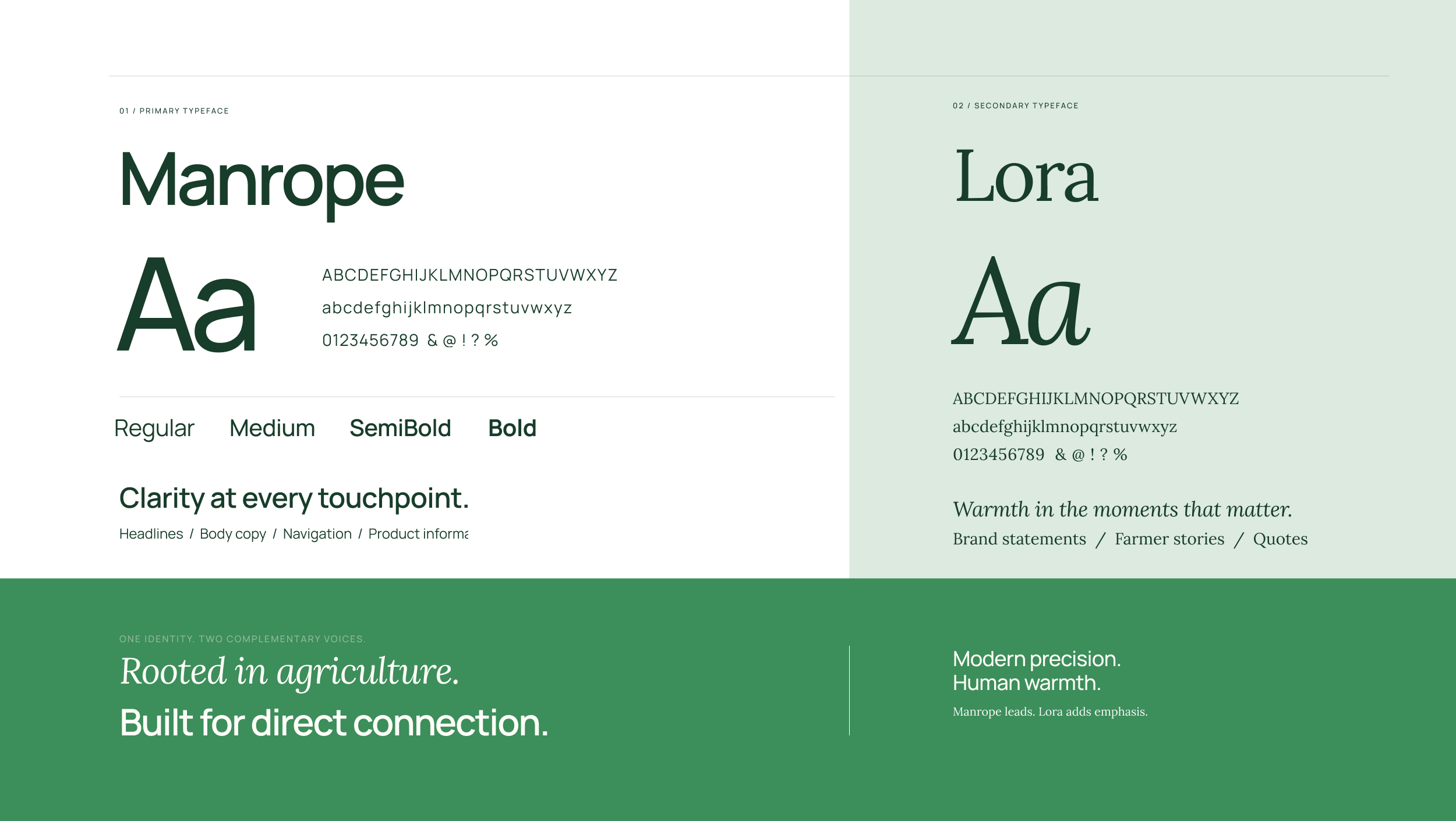
We created a distinctive FD monogram with a subtle plant-bud detail, supported by refined typography, natural green tones, and a flexible visual system. Every element was designed to feel agricultural without looking conventional, giving FarmDirect a modern, credible, and ownable identity.
Rooted in Where Food Begins.
Designed for Where It’s Going.
FarmDirect was built to make the connection between growers and customers feel simpler, closer, and more human.
A modern identity rooted in agriculture, shaped for a more direct future of food.
Let's Talk
Got a startup idea? Tell us what you’re building — and let’s figure out how to make people believe in it.